Sponsored Link
A try to make a good Metacity for Lucid.
Concept
The art is made with Inkscape. I will public some proposal versions. So I hope for some comments in critics and ideas. I can do only the graphical-part.
About my idea: "I think the Metacity should be more EyeCandy than in the current version (Karmic). It's nice, but a little bit hard and a old trend. I want make a Metacity, what is modern, pretty and as small as possible. Small, because the waste of space for a Windowsdecoration is in my Eye not wished by the most of users. At moment I will draw some ideas with the current color of the Metacity in Karmic. In the end I will draw more color-variations, too."


Brown!?! When I think of modern, brown does not come to mind. I am using the New Wave theme, but it too looks archaic compared to KDE’s new theme, Mac, and Windows 7. Time to think outside the box a little (literally).
uhhhhhhhhhhhhhhh looks horid
I don’t think that this proposal is necessarily reflecting a ‘new trend’, although critical of the old trend in the current ubuntu metacity theme (which I would prefer to the current version here). And believe me most users would, in fact, ‘waste’ (if itis so) some more space to get more eyecandy. Really, good luck with the effort but I agree with jeremy.
WTFFFF Beurk >O<
Looks like a windows NT theme… hmmm.
I would love to see something much more modern.
One of the first things I do on a fresh installed Ubuntu PC is to change the desktop theme. I do not like the brown color and I always think when seeing an unfocused window that it was broken (because the brown bar is only visible on focused windows ? really ugly).
Thats how my Desktop looks momently:
http://tinyurl.com/yzrbfrf
The circles are some kind of unusual but they fit good together with the environment (there is some kind of harmony with them).
The visual things looks now with karmic much better than before – but the standard installation compare to what you can do with Ubuntu is not the best (a lot of people are really fixed on eyecandy).
An other aspect is, that the window bar are wasting space for almost nothing (name and one Icon).
Don’t understand me wrong, I feel a lot of respect for your work, but when asking for feedback I say what I have to say.
Greetings
Paradiesstaub
I agree…. brown isn’t modern anywhere.
Maybe now there is space for some dark grey or black theme.
I agree with most of the comments above, brown and most colors similar to it like the previous orange theme are just old and boring. It looks nice, since this theme is clean with good looks – but the color choice is still horrible. I thought I heard they were moving to blue or something.
Default Ubuntu themes are always boring but they get the work done for simple users.
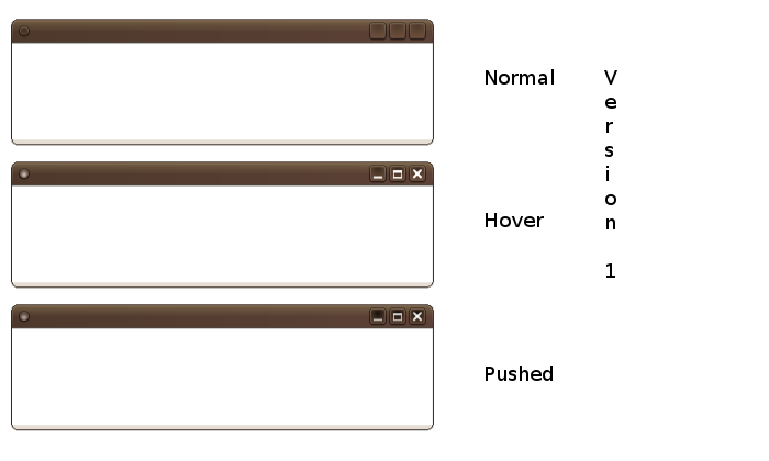
version 1. The variations between hover, normal and pushed are visible.
Brown: Nice color. Don’t care of majority. Majority don’t use Ubuntu, demonstrate an acculturated and nihilistic sense of beauty, and produce horrible dark theme in gnome.look. Variations from orange to brown are deeply associated to Ubuntu Brand. Alternative themes can provide other colors.
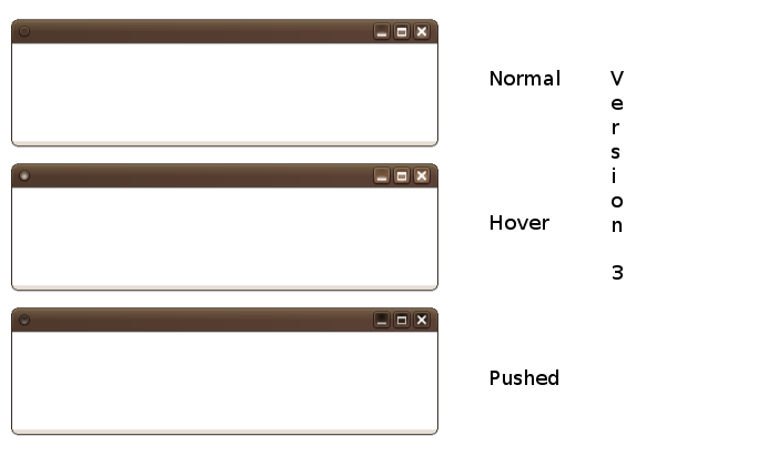
My vote is definitely version 1, with the hover of version 3.
@Jeremy: KDE is ok, Mac ..those who like it, W7 ..in my opinion the buttons are nice, but the whole Aero-Style is nothing what I really like.
@Tite-Live: The possibilities with the Metacity are very limited. For examples u can’t work with transparency … 😉
@Paradiesstaub: Ok, it’s ur opinion. But circle buttons aren’t my goal. Circle buttons are for Mac and KDE. I won’t go this way. The most of those round buttons I tested wasn’t enough EyeCandy for saying: “wow”.
@Lindomar: Brown, because it’s associated to the Ubuntu-Brand and it’s the same color of the default Metacity u have in Karmic. Brown against blue is a warm tone. Grey and black, in my eyes, are not colors and I won’t do any tries with those. Black don’t allows the play with shadows and other effects. Black surely that not!
@Si: Firstly I have to find the final solution, than I will do different colors-variations, too.
@Abhishek S.: Mhh I think that with Karmic the default got out of boring. With Karmic I used only the default for a long time and it was quite EyeCandy for me. But now we can help, that Lucid will be even better. So I do my part and try …
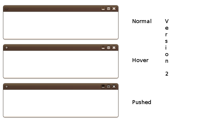
@all: Thanks for ur feedbacks. But at moment I need more tips, votings between the versions and/or some words specific a version. Have in mind that I still haven’t finished with all versions; have more ideas … 😉
PD: Lucid won’t have only a Metacity. Here is a new effort in something new… The future will show if it works fine and can be implanted to Lucid. It’s something similar to Google-Chrome Windowsdecoration u can put Tabs in it.
best regards, scholli
@Victor: Exactly. I thought in Version 1 with the Hover and Pushed of Version 3. Soon I will public it … 🙂
I like version 3 the best, and actually I am so tired of blue from using windows, that I LOVE the Ubuntu orange and brown colors. I agree that we should let gnome-look provide the blacks, grays, and blue themes.
Those who are griping about the color have no real ideas so you can ignore them. Use of the term “modern” is insufficient for theme design. What is modern to one person is not to another and it is a moving target.
If you place form before function, you’ll fail. Design for function first then form. To that end the size of your borders could make resizing difficult.
You should also keep the Gnome interface guide close to you when you do this sort of work. Otherwise you are likely to design some ignorant buttons that use non descriptive circles.
@Fr33d0m: Modern in the sense of: smooth and realistic vs. hard contrast and outlines. My intention is only to move the exist default to an improvement.
Please don’t afraid about function and resizing. If it is converted to something real, it will work how it should and without problems in resizing.
The Gnome-interface-guide is no theme for now… I publish only ideas in something visual. In the end I will look for somebody with knowledge about hacking a Metacity.
PD: Still there’s a lot of time. There will be more evolutions; important is to begin something and give it a try … 😉
I vote for version 3.
about V1 usability: IMO icons on the buttons are a must. They are not needed for computere literate, but I knew few people who didn’t know what this buttons do. Taking icon away, takes their only clue(they usually also don’t know that they can hover over buttons).
I like also version 3 most.